5,000+ Entertainment Design Cases, 20+ years Amusement Industry Experience - ESAC Design Sales@esacart.com+086-18024817006


How to Choose Brand Colors: Injecting a Unique Soul into Your Brand
About Color
Good use of color, whether the brand is cold and bleak, or colorful, as if it has life, not only to give people visual enjoyment, but also to convey more emotions and attitudes, to enhance the brand recognition and personality of the product.
Part.01
Due to the sensitivity of human beings to color, color can quickly influence emotions and behaviors, and brand color, as one of the core elements of the brand's visual image, can attract the attention of consumers in an instant.
Enhanced brand recognition
Color is one of the most immediate visual elements to stand out from the crowd of brands. For example, the green color of Starbucks represents: environmental protection, freshness, creativity and comfort. It brings pleasant sensory enjoyment to consumers, attracts users to take photos, and realizes effective communication.
▲ Image Source Web
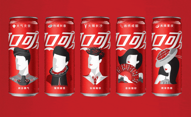
Coca-Cola, known as “Happy Fatty Water”, is the source of happiness for countless people. The red color of the brand gives people an enthusiastic, energetic and joyful brand image, and even continuously strengthens the association between red color and joy, so that consumers will think of Coca-Cola no matter if they are happy or unhappy.
▲ Image Source Web
Convey brand emotion and personality
In different countries and regions, many colors have formed unique meanings and definitions, with both beautiful connotations and taboo meanings. Therefore, when choosing colors, brands need to fully understand the emotions conveyed by different colors, so as to clarify their corresponding brand temperament.
▲ Image Source Web
Red It is the first choice of many well-known brands. This color, with its passionate, enthusiastic, powerful and tense qualities.
▲ Image Source Web
Pink It's just like the color red, but not too flashy. High brightness of light pink is very romanticism flavor, people feel soft, warm and lovely. However, pink is not exclusively female color, saturated pink is full of good and lively temperament.
▲ Image Source Web
Blue It is regarded as a symbol of trust, professionalism and reliability, and is the basic color of the sea and the sky, giving people a sense of sublimity, cleanliness, depth, professionalism and efficiency.
▲ Image Source Web
Orange The orange hue, which leans toward yellow, in particular, is the leader in brightness among colors. It symbolizes creativity and joy, representing the release of energy and an optimistic temperament. This color is able to convey the visual sensation of brightness, pleasure, joy and kindness, giving a soft and warm visual impression.
▲ Image Source Web
Yellow In the orange color is very creative and full of joyful atmosphere, is the color of the brightest sense of the strongest colors, symbolizing the release of energy and optimistic temperament, conveying to people a bright, happy, happy, friendly, soft visual impression.
▲Image Source Web
Green It is a peaceful color that can be found everywhere in nature and is particularly gentle to the human eye, symbolizing peace, life, health and environmental protection, bringing a sense of tranquility and security.
▲Image Source Web
Violet It is a mysterious and unique elegant color, which represents nobility, mystery, romance and elegance, giving people a deep and fascinating feeling. It is also the ideal color for art and design to attract people's imagination. People in the purple environment will become dreamy, active thinking and full of imagination.
▲Image Source Web
Multicolor Often used by creative, multidisciplinary or children's brands, they are both bold and striking, making them hard to forget. A primary color is usually chosen and adjusted and matched by combinations of brightness, saturation and complementary colors.
▲Image Source Web
Influencing consumer buying decisions
In the 7-second color theory shows: a product instantly into the consumer's field of vision and leave an impression of time is 0.67 seconds, the role of color to 67%;
For the 7-second color theory, Nescafe once did an interesting test, the same coffee in green, red and white cups, let consumers taste, the results are: most consumers think that the taste of the red cup in the best, and green cups feel acidic, white cups feel light, so Nescafe chose red as the main color of the package design, the results of a launch! Nestle chose red as the main color of the package design, and the result was a big hit in the market as soon as it was launched.
▲Image Source Web
Part.02
How to choose brand color
Colors are influenced by three dimensions: physiology, abstraction and culture. By understanding the properties of color, analyzing the trend of color in the industry, as well as the brand's cultural strategy and communication tone, the scope of color selection can be clearly defined.
Understanding brand colors in the industry
In the industry of color, sometimes form a certain law, such as science and technology industry like to use blue, environmental protection industry love green, and in the amusement industry on the color of the choice of a higher degree of freedom, most of the more inclined to colorful color performance.
▲ Elephant Art Case - Ulaanbaatar Sky Realm VIS Design
Choosing colors that are common to the industry can be a double-edged sword, using them to make the scope of its business quickly known, but also tends to make it difficult to stand out by being overwhelmed by its many peers. This is also a good time to think about colors that fit the industry's attributes but differentiate it from its competitors.
Analyze the brand's own attributes
Understand the age, gender, cultural background and preferences of the target audience. In addition, the brand's positioning description, vision, mission, values and other brand concepts also have a subtle influence on the selection of brand colors.
▲ Elephant Art Case-Kunshan 4FUNVIS Design
As an example, the recently hot digital sports and trendy playground business, 4FUN project, after locking the target group for young people, around the 4 functional partitions, chose the four major color systems of blue, green, orange and red, and used the design techniques to give the brand a youthful, fashionable and high-class tone.
What kind of impression the brand wants to give to the audience
The impression that a brand wants to convey to the public is an important factor in determining the design style of the brand, especially the colors. Choosing the right color or set of colors can quickly create a design style that fits a certain bias.
If you want to convey a wise and rational impression, you can choose blue. If you want to convey a lively impression, you can choose saturated and rich colors. If you want to convey an impression of originality and nature, then you can choose green colors.
▲ Elephant Art Case - PLAYERONE VIS Design Cambodia
High-end brands typically choose simple, understated colors, such as black or gold, while affordable, mass-market brands may choose bright, vibrant colors.
Setting the main color of the brand
The main color of a brand can also be called the brand color or brand standard color. The brand color signifies the spirit and culture of the brand, conveying a strong impression through the appropriate use of the color to achieve the role of color in the visual communication of the brand.
▲Elephant Art Case - Yuekong City Brand VIS Design
Brand color value setting, you need to give three modes of color value, RGB color value for screen display, CMYK color value for printing, and spot color number. It should be noted that the main color of the brand is not necessarily the color with the largest area in the screen, but it is certainly the color with the most important position in the screen.
Setting of secondary colors
In order to fully convey the brand impression, the secondary colors need to be determined on the basis of setting the main brand color.
Secondary colors can be set to complement the main color of the brand, such as setting a dark color as a bright secondary color. It can also be synergistic with the main color of the brand in order to communicate a more complete brand impression, so that you can choose the same saturation, brightness, but the hue of different colors.
▲ Elephant Art Case-Nanjing Bonova VIS Design
If you want to highlight the brand color, but are concerned about the limited use of the brand color in different scenarios, you can set the same color phase of the brand color, but darker or lighter colors as secondary colors.
Setting the ratio of color usage
It is also very important to set the proportion of the main and auxiliary colors, and different proportions can bring different feelings for the audience.
▲ Elephant Art Case - Guangzhou Nansha Super Fun World VIS Design
In the project of Guangzhou Nansha Super Burning Fun World, a large proportion of the operation ice blue color can well give the brand a sense of technology and futuristic tone.
About Popular Colors
Colors are trending, and when brands choose the color of the year, there are both advantages and disadvantages; pop colors do bring freshness to a brand and can quickly get the attention of consumers. At the same time, it will be because the trend wanes and pop colors are easily outdated.
Part.03
Combining with materials, craftsmanship, and lighting
In the application field of brand color, generally through planning and conception, the techniques of craftsmanship, the unique properties of materials and the lighting layout are deeply integrated and multi-dimensionally applied.
▲ Elephant Art Case-Dongguan Mannerist Castle Kingdom
For example, in the implementation of the painting process, it is necessary to accurately control the saturation and uniformity of the color to ensure that the brand color on the surface of the object presents the desired visual effect;
▲ Elephant Art Case-Meishan Wunxi Terrace Sunny Honey Island
For the choice of materials, we will fully consider its texture, texture and brand color coordination, such as choosing wood with delicate texture or metal with appropriate gloss to carry and highlight the charm of the brand color;
In terms of lighting design, the clever use of color temperature, brightness and irradiation angle changes, so that the brand color in different light environments to show a rich layer and unique atmosphere.
▲ Elephant Art Case-Shenzhen Yuekong City Video Game World
For example: Ice blue and magenta were used as the brand colors in the project of Shenzhen Yuekong City Arcade World. For the door header, aluminum sheet metal with weather resistance and glossy finish was chosen, which was cut and bent to create a simple, atmospheric and stable image. The use of glowing light strips throughout the overall shape gives the overall visual of the doorway a more cyberpunk sensibility. The ambient feeling of the door header can also greatly enhance visitors' recognition of the brand.
ESAC has been solely focused on one thing for over 23 years